Visualizing the COVID-19 Outbreak
An interactive visualization of live data about the COVID-19 outbreak across the United States.
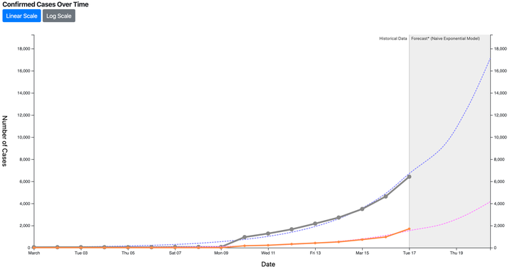
Wondering how quickly COVID-19 is spreading? Thanks to a regularly updated COVID-19 data source maintained by Johns Hopkins University researchers, VACLab teammate David Gotz has posted a simple visualization of confirmed cases over time for both the entire United States and individual states. The dataset includes cases from cruise ships off US shores as well as US territories.
In addition to visualizing historical data captured over the course of the outbreak, it also includes a best-fit exponential model and an extrapolation of where the confirmed count might go over the next three days.
You can view the visualization by clicking here.
The visualization pulls new data every time you reload the page, so it shows the latest figures captured by the data source. Of course, the regular caveats apply: the data may not be accurate, and even accurate figures represent the number of cases confirmed by COVID-19 testing. Test shortages and other factors mean that these figures do not accurately represent the actual prevalence of COVID-19 in the population. In addition, the simple exponential model used in the visualization is not a realistic model for disease spread. Any serious analysis would need to employ a more sophisticated epidemiological model.